Mostrando entradas con la etiqueta Arquitectura. Mostrar todas las entradas

lunes, 1 de diciembre de 2014

CaixaForum Zaragoza de Carme Pinós

En el año 2008 salió a concurso el CaixaForum Zaragoza, en una nueva área denominada Milla Digital, recuperada de los terrenos de la antigua estación ferroviaria de El Portillo. Este desarrollo urbano planeado por el Ayuntamiento, junto con la Escuela de Arquitectura del MIT, conforma la ‘Ciudad de la Innovación y el Conocimiento’. El proyecto ganador, del estudio de Carme Pinós, se inserta en el Parque del Portillo, la mayor zona verde del centro de la ciudad. Con 6.000 metros cuadrados, el volumen se define como nuevo referente cultural de Zaragoza, desde donde se puede observar el paisaje urbano en los espacios de transición entre las salas de exposiciones.
El edificio, que alberga un nuevo museo, quiere formar parte de Zaragoza. Por ello se constituye como un volumen singular de apariencia escultórica, formado por dos piezas desplazadas entre sí que permiten la observación del paisaje urbano. La elevación de los dos cuerpos que albergan las salas de exposiciones y el restaurante permite liberar la planta baja, dando continuidad al parque por debajo de una parte del edificio y conectándolo así con la ciudad de Zaragoza.

La estructura del museo está formada por una serie de muros de carga, un pilar fusiforme y un núcleo de hormigón armado en que se apoya una subestructura de acero formada por varias cerchas trianguladas, que funcionan como voladizos. El pilar fusiforme, de 25 metros de alto, que tiene como armado una cercha de acero triangulada, se ocupa de mantener la gran cercha que alberga la planta tercera y la cuarta del edificio, y resiste los esfuerzos del voladizo de la segunda planta.

Tanto las escaleras para visitantes, que se encuentran en el núcleo central de hormigón armado, como las de emergencia, en el exterior, soportadas mediante una estructura ligera, funcionan como elementos representativos. La fachada se cubre mediante bandejas de chapa de aluminio de 3 mm de espesor, que han sido previamiente definidas mediante procesos de perforación o de embutición, y que crean una envolvente continua con dibujos orgánicos.


http://www.arquitecturaviva.com/es/Info/News/Details/5929

lunes, 27 de octubre de 2014

3M headquarters in minnesota revamped by atelier hitoshi abe


The global headquarters for ‘the 3M company’, located in st. paul, minnesota, has undergone extensive renovations involving a team of architects including atelier hitoshi abe and peter ebner and friends. each firm had separate responsibilities in the transformation of the corporation’s work environment, which is comprised of four structures linked by a second story walkway. specifically, atelier hitoshi abe’s scope included the conversion of the site’s central parking lot into a large plaza, the addition of many open and collaborative work spaces, as well as the redesign of various other public areas such as the employee entrance and café.


the renovation work transforms the site’s existing central parking lot into a pedestrian plaza. its design is characterized by a tangram patterning of tiles, with similarly shaped concrete planters, seating, and shade canopies. the surfaces utilize 3M stamark tape, a highly reflective adhesive backed material typically used for roadway markings.


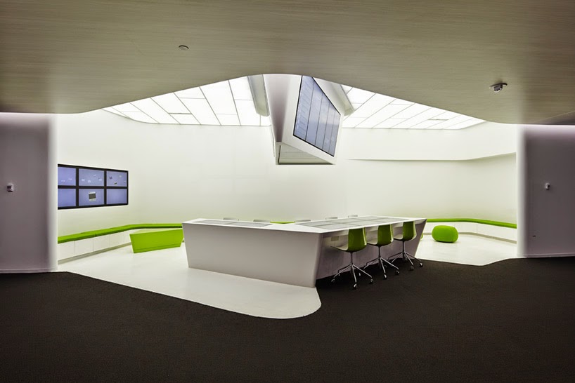
the project attempts to subvert the complex’s previous arrangement, comprised of highly compartmentalized rooms, by inserting many open work spaces throughout the office structures. these ‘hubs’ were strategically located in key areas of the buildings to encourage informal congregation, discussion, and foster collaboration among various departments. specifically, these zones provide touch screen computers integrated with table surfaces, allowing for digital connection to complement face to face meetings. the interface allows employees to access network files, as well as link up their mobile devices and lap tops in order to seamlessly share information.


the open collaborative spaces are situated in transitional areas of the complex, which are typically considered less useful in workplaces, but where highly productive informal discussions tend to occur. each ‘hub’ is distinguished with brightly colored furnishings, and feature LED screens which present a constant stream of information. the displays are typically integrated with soffits protruding from the ceiling, and inform employees and visitors of news, announcements, and events for the minnesota campus as well as 3M workers around the globe.


various other spaces throughout the campus have been redesigned to reinvigorate the complex. for example, a large ‘forum’ area accommodates larger groups for trainings, seminars, or new employee orientation, with glazed partitions providing maximum daylight penetration and transparency. adjacent, a café provides a place to grab a coffee and light snack, as well as seating for meetings and an open working area.


additionally, two new stairs serve to improve circulation between different levels. one, painted in black, creates a direct connection between the primary employee entrance and the level below, providing access to the central plaza. a red-painted staircase links the dining area on the main floor to the lower level employee mall. in addition to a 3M shop, the mall contains various shops and services that include newspaper stands, a recreation room, laundry facilities, and a credit union.


http://www.designboom.com/architecture/3m-headquarters-minnesota-atelier-hitoshi-abe-07-08-2014/

viernes, 26 de septiembre de 2014

neri & hu stacks rectangular frames on le meridien zhengzhou facades


For the recently completed ‘le meridien’ hotel in zhengzhou, china, neri&hu design and research office have conceived a tower which is composed of stacked frames around its façades. the strategy serves to break down the large scale of the structure, while creating an identity for the building which is envisioned as a landmark for the henan province. conceptually, the building is imagined as an ‘archive’ of new and old artifacts, which become a point of discovery for travelers as well as regional residents. the 25 floor high-rise is comprised of a 5-storey podium at its base containing public functions, and 350 private guestrooms in the levels above.


multiple box volumes in the tower’s composition are cantilevered outward, and treated with different tints of green glazing. these elements are further distinguished by their black and coffee colored metal cladding, which is textured with perforations to create patterns that reference the local henan wild rose.


the design of the 5-storey podium is influenced by the regionally historic longmen caves, a prominent example of chinese buddhist art carved into limestone cliffs. a sense of excavation is expressed through various openings surrounding the central atrium, which visually connect the public areas across multiple floors. above, skylights provide shafts of daylight which serve to highlight the sedimentary pattern on the gray sandstone clad walls.  green tinted windows and a sequence of chandeliers suspended high in the space help to produce a colorful ambience.


the main idea behind the design of the guestrooms is to express a contrast between light and dark. the living and sleeping areas are defined by their gray walls and a stained timber wainscot, while the bathrooms are  entirely finished in white and glass materials.

to disrupt the monotony of typical hotel elevator lobbies and room corridors, three-storey atriums are composed throughout the tower, and accommodate art installations.


le meridien zhengzhou includes three restaurants and a rooftop bar, with each receiving a different architectural treatment. the japanese restaurant features walnut boxes hung from the ceiling at different heights, creating a dynamic form above the dining area. a chinese restaurant contains private eating rooms, distinguished as black mesh volumes. below, an all day dining restaurant is lit by illuminated volumes which protrude from the ceiling.


http://www.designboom.com/architecture/neri-hu-le-meridien-zhengzhou-07-17-2014/